The Font Selection Problem
Every designer has been there.
You're staring at a font picker, scrolling through hundreds of options, trying dozens of combinations, and still not sure if you've made the right choice.
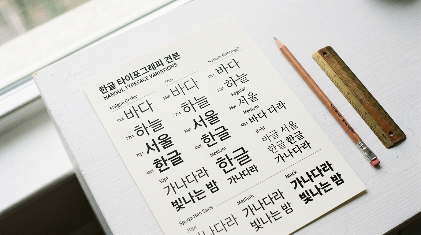
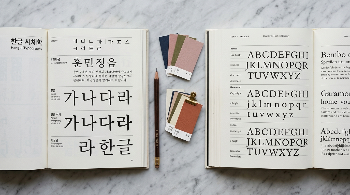
For projects involving Korean typography, this challenge multiplies — you need fonts that work across two entirely different writing systems.
Traditional font selection relies on experience, intuition, and a lot of trial and error.
But what if an AI could understand the mood of your project and recommend fonts that match — complete with CSS code and a full design guide?
That's exactly what Gulim's AI Font Sommelier does.
What Is the AI Font Sommelier?
The AI Font Sommelier is Gulim's core recommendation engine.
Like a wine sommelier who matches the perfect bottle to your meal, our AI matches the perfect fonts to your design context.
Here's how it works: you describe what you're designing — a luxury brand website, a playful children's app, a minimalist portfolio — and the AI analyzes your description to recommend Korean and English fonts that capture that exact mood.
But it doesn't stop at font names. The Sommelier delivers a complete typography package:
- Matched Korean fonts with similarity scores
- Complementary English fonts for bilingual projects
- Ready-to-use CSS snippets — copy, paste, and ship
- A full design guide including color palette, typography scale, and usage tips
How the Recommendation Engine Works
Step 1: Mood Analysis
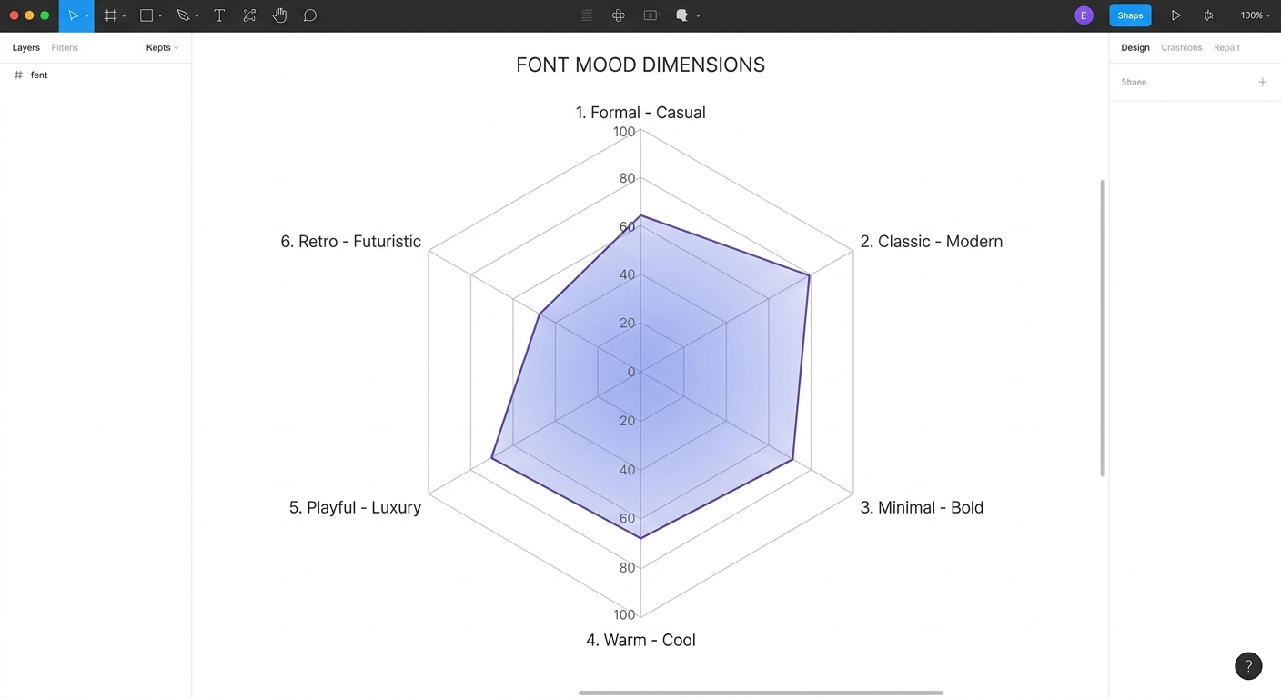
When you describe your project, the AI breaks down your input into mood dimensions.
Gulim's engine maps text to a 12-dimensional mood vector spanning axes like:
- Formal ↔ Casual
- Classic ↔ Modern
- Minimal ↔ Intense
- Warm ↔ Cool
- Playful ↔ Luxury
- Retro ↔ Futuristic
Each font in Gulim's database has been pre-tagged with its own mood vector, created through a combination of typographic analysis and human curation.
The engine uses 167 curated keywords that map to specific positions in mood space.
Step 2: Vector Similarity Search
With your project's mood vector computed, the engine performs a similarity search against the entire font database using pgvector — a PostgreSQL extension for vector operations.
This finds fonts whose mood profiles are mathematically closest to what you described.
The result isn't just a single "best" font — it's a ranked list of recommendations with similarity scores, giving you options that all fit your mood but offer different flavors.
Step 3: Cross-Script Pairing
For bilingual projects, finding fonts that harmonize across Korean and English is critical.
The Sommelier doesn't just recommend Korean and English fonts separately — it finds pairs that share visual DNA:
- Weight harmony — similar stroke thickness and density
- Mood alignment — matching personality across scripts
- Metric compatibility — consistent x-height and spacing feel
Step 4: Design Guide Generation
The final step transforms raw font data into actionable design guidance.
Based on the dominant moods detected in your query, the engine generates:
- Typography presets — heading scale, body size, line height, letter spacing
- Color palette — primary, accent, background, surface, and text colors matched to the mood
- Usage tips — contextual advice for applying the fonts effectively
Using the Sommelier
On the Web
Visit gulim.xyz and describe your project in the search bar.
You can type in English or Korean — the engine understands both.
Example queries:
- "luxury fashion brand website"
- "친근한 교육 앱"
- "minimalist tech startup landing page"
- "따뜻한 카페 브랜딩"
The results page shows your recommended fonts with live previews, a mood analysis breakdown, and a complete design guide you can download or copy.
Via the API
For developers who want to integrate font recommendations into their own tools, Gulim offers a public API:
curl "https://gulim.xyz/api/v1/fonts/recommend?keywords=modern,minimal,clean"
The API returns structured JSON with Korean fonts, English fonts, mood vectors, design guides, and CSS snippets — everything you need to programmatically apply typography decisions.
In Your IDE
Gulim also ships as a Claude Code agent skill, letting you get font recommendations directly in your terminal while coding.
No context switching required.
Real-World Use Cases
Case 1: Startup Landing Page
Query: "clean modern SaaS startup"
The Sommelier recommends Pretendard (Korean) paired with Inter (English) — both geometric sans-serifs with excellent screen readability.
The design guide suggests a minimal color palette with generous whitespace and a 1.25 heading scale.
Case 2: Traditional Restaurant Branding
Query: "전통 한식당 고급스러운"
For a premium Korean restaurant, the engine surfaces Noto Serif KR paired with a classic serif — capturing the formal, warm, and slightly luxurious mood.
The color palette leans into deep warm tones with gold accents.
Case 3: Youth-Focused App
Query: "playful colorful kids education"
The results shift dramatically — rounded, friendly typefaces with high readability at large sizes.
The design guide recommends vibrant, high-contrast colors and generous spacing for young readers.
What Makes Gulim Different
Mood-First, Not Category-First
Most font tools organize by category (serif, sans-serif, display).
Gulim organizes by feeling. You describe what you want to communicate, and the AI finds fonts that communicate it.
Bilingual by Design
While other recommendation tools focus on single-script matching, Gulim was built from the ground up for Korean + English pairing.
Every recommendation considers cross-script harmony.
Beyond the Font Name
Getting a font recommendation is only half the battle.
You still need to decide on sizes, weights, colors, and spacing.
Gulim's design guide bridges the gap between "which font?" and "how do I use it?"
Open and Accessible
Gulim's font database focuses on open-source and freely licensed fonts.
Every recommendation comes with clear licensing information and CDN links, so you can use them immediately without legal concerns.
Tips for Getting Better Recommendations
- Be specific about context — "luxury hotel website" works better than just "elegant"
- Mention the medium — screen vs. print, UI vs. editorial, large display vs. small body text
- Use mood words — warm, cold, playful, serious, futuristic, traditional
- Mix languages — the engine handles Korean and English keywords equally well
- Try variations — "minimalist" and "clean simple modern" may surface different gems
What's Next
We're continuously expanding Gulim's capabilities:
- Image-based mood detection — Upload a design mockup and get font recommendations that match its visual style
- Font comparison tools — Side-by-side previews with real Korean content
- Community curation — User-submitted pairings and reviews
Start Exploring
The best way to understand the AI Font Sommelier is to try it.
Head to Gulim, describe your next project, and see what the AI recommends. You might discover your new favorite font.
For developers, check out the API documentation or install the Claude Code font skill to bring font recommendations into your workflow.