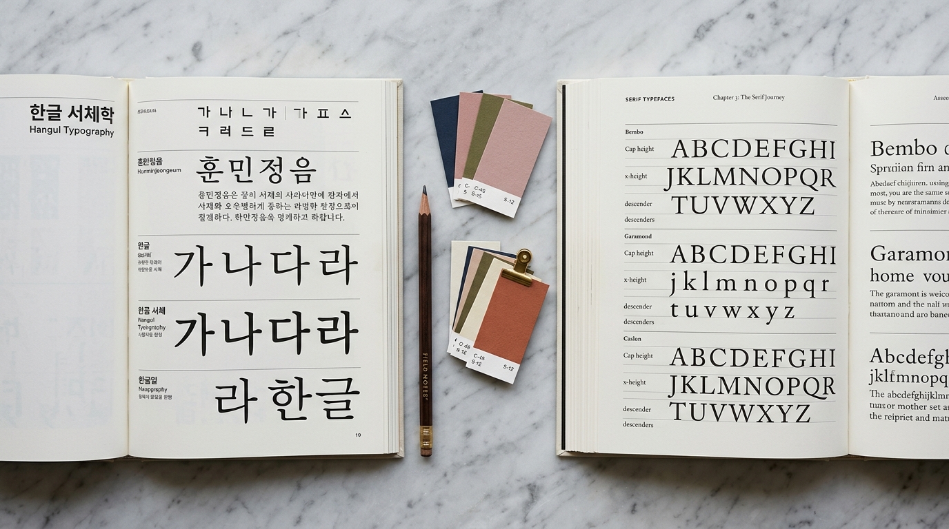
Why Korean Typography Matters
Korean is spoken by over 80 million people worldwide, and the Korean Wave (Hallyu) has made Korean culture — from K-Pop to K-Drama to K-Beauty — a global phenomenon.
As brands expand into Korean-speaking markets, understanding Korean typography isn't just nice to have — it's essential.
Unlike Latin scripts where a handful of reliable typefaces can carry most projects, Korean typography presents unique challenges.
Hangul, the Korean writing system, contains thousands of possible syllable blocks, each requiring careful design consideration.
Choosing the wrong font can undermine your entire design, making text hard to read or culturally tone-deaf.
This guide will walk you through everything you need to know about Korean typography, from the fundamentals of Hangul to practical font selection strategies.
Understanding Hangul Structure
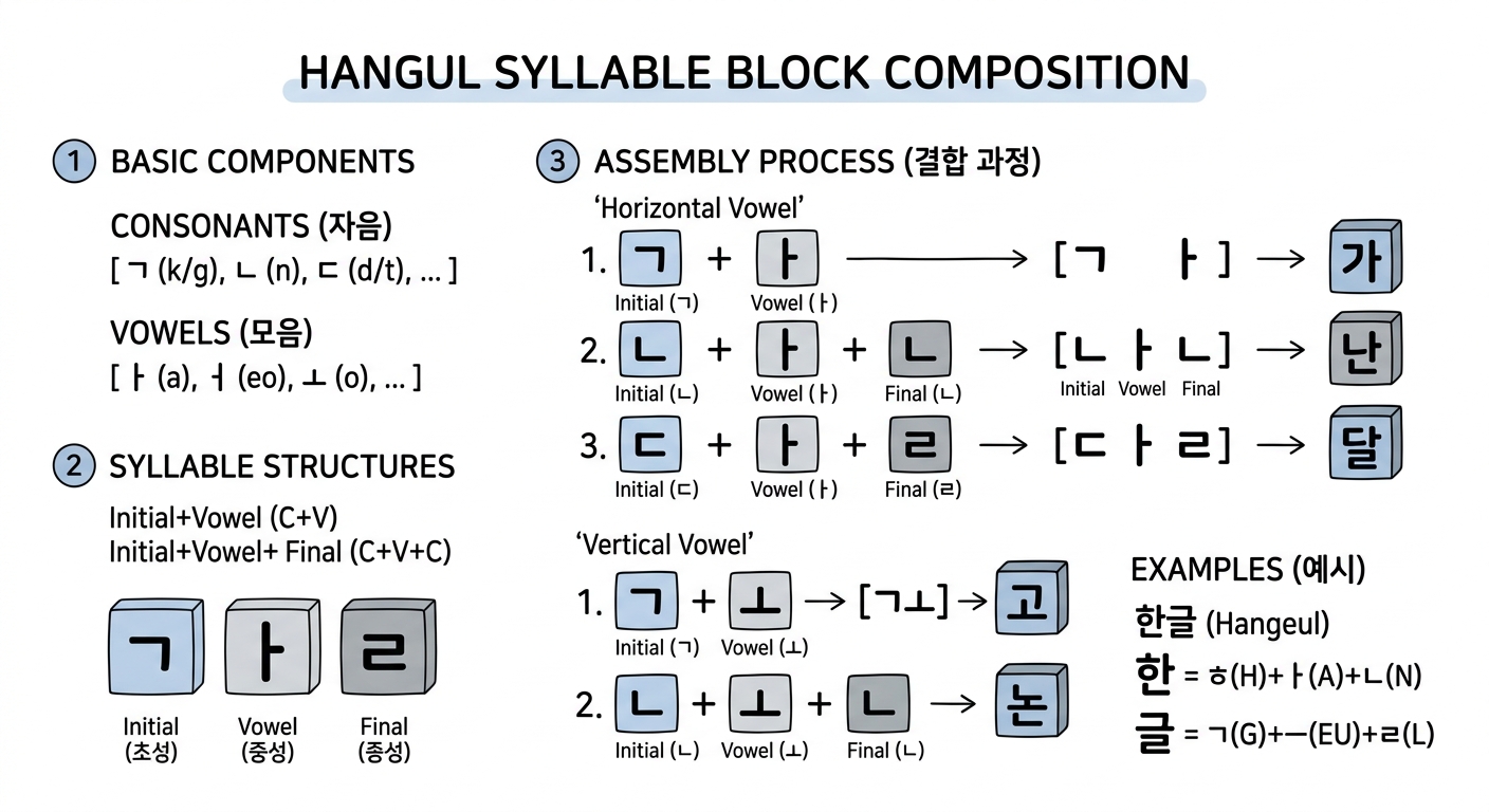
Hangul is one of the most scientifically designed writing systems in the world.
Created in 1443 by King Sejong the Great, each character is built from a combination of consonants (자음) and vowels (모음) arranged into syllable blocks.
The Building Blocks
Korean has 14 basic consonants and 10 basic vowels.
These combine into syllable blocks following specific structural patterns:
- CV (consonant + vowel): 나, 미, 소
- CVC (consonant + vowel + consonant): 한, 글, 빛
- CVCC (consonant + vowel + double consonant): 닭, 읽
Each syllable block occupies a uniform square space, similar to Chinese characters but fundamentally different in construction.
This square-block system means Korean fonts must balance the visual weight of simple two-component blocks (like 나) against complex four-component blocks (like 읽).
Why This Matters for Font Design
The syllable-block structure means that a complete Korean font needs to support 11,172 possible combinations (the full set defined in Unicode).
Compare this to the 26 uppercase + 26 lowercase letters needed for basic Latin — Korean font design is an enormous undertaking.
This is why many Korean fonts feel "heavier" or "denser" than their Latin counterparts.
Designers must pack more visual information into each character while maintaining readability and aesthetic consistency.
Korean Font Categories
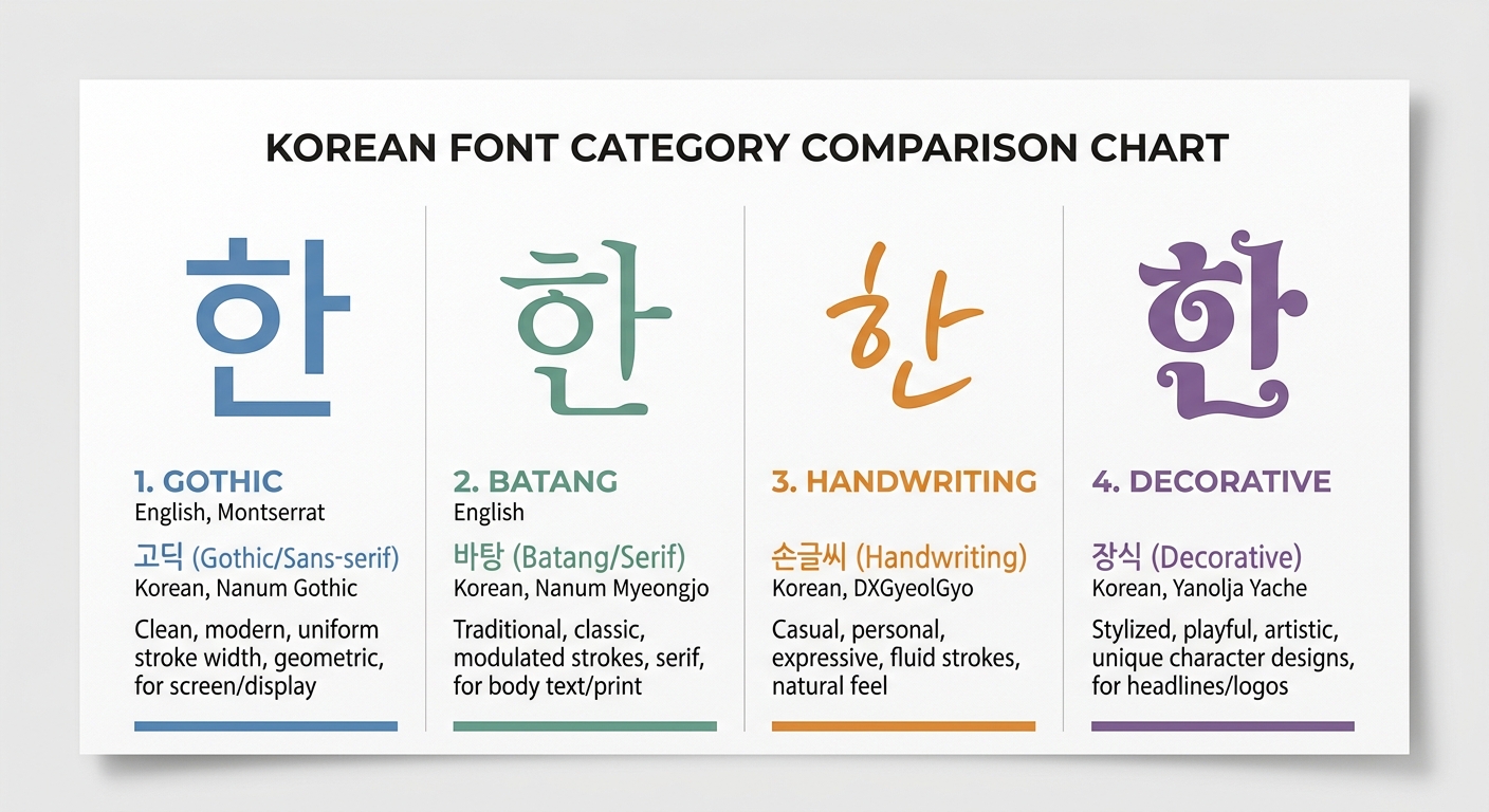
Korean fonts are traditionally classified into several major categories.
Understanding these categories is crucial for making appropriate typographic choices.
Gothic (고딕체)
The Korean equivalent of sans-serif.
Gothic fonts feature uniform stroke widths without decorative endings.
They are the workhorse of Korean typography, used extensively in UI design, body text, and headlines.
When to use: Digital interfaces, body text on screens, modern branding, clean layouts.
Popular examples: Noto Sans KR, Pretendard, SUIT, IBM Plex Sans KR.
Batang (바탕체)
The Korean equivalent of serif fonts.
Batang features stroke variations and small decorative elements at stroke endings.
The name "바탕" literally means "foundation" or "base," reflecting its role in traditional Korean typesetting.
When to use: Long-form reading (books, articles), formal documents, traditional branding.
Popular examples: Noto Serif KR, KoPub Batang, Nanum Myeongjo.
Myeongjo (명조체)
A subcategory of Batang that draws more heavily from Chinese calligraphic traditions.
Myeongjo fonts have more pronounced thick-thin stroke contrast and distinctive serif-like endings.
When to use: Premium branding, editorial design, luxury market materials.
Handwriting (손글씨체)
Korean handwriting fonts capture the natural, personal feel of hand-drawn characters.
They range from neat, careful handwriting to loose, casual scrawling.
When to use: Personal branding, greeting cards, casual marketing, food and lifestyle content.
Decorative (장식체)
Display and decorative fonts designed for headlines, posters, and visual impact.
This category encompasses everything from pixel fonts to brush-stroke fonts to experimental typography.
When to use: Headlines, posters, logos, creative campaigns — never for body text.
Choosing the Right Korean Font
Selecting a Korean font involves considering several factors beyond simple aesthetics.
Readability at Target Size
Korean characters are inherently more complex than Latin letters.
A font that looks beautiful at 48px headline size might become illegible at 14px body text.
Always test your font choice at the actual sizes you'll use.
Rule of thumb: For body text on screens, stick to well-hinted Gothic (sans-serif) fonts at 16px or larger.
Weight Availability
Many free Korean fonts only come in one or two weights.
If your design system requires a range of weights (thin through black), check availability before committing.
Fonts like Pretendard and Noto Sans KR offer 9 weights, making them versatile system fonts.
Language Coverage
If your project involves both Korean and English text, you need fonts that handle both scripts well.
Some Korean fonts include Latin characters designed to harmonize with the Korean glyphs, while others rely on fallback fonts for Latin text.
Best practice: Use a Korean font with good built-in Latin support, or carefully pair a Korean font with a complementary Latin font.
Licensing
Korean fonts have varying license terms.
Many excellent fonts are released under open-source licenses (SIL OFL, Apache 2.0), while others require commercial licensing.
Always verify licensing before deploying to production.
The Korean government and major companies (Naver, Kakao) have released many high-quality free fonts.
Check platforms like Gulim to explore licensed Korean fonts with detailed metadata.
Web Font Best Practices for Korean
Korean web fonts present unique performance challenges due to the large character set.
Here's how to handle them effectively.
The Size Problem
A typical Latin web font file is 20–50 KB.
A Korean web font can easily exceed 2–5 MB because it must include thousands of glyphs.
Loading a full Korean font file synchronously will destroy your page load performance.
Subsetting
The most effective optimization strategy is font subsetting — including only the characters your content actually uses.
For dynamic content where you can't predict which characters will appear, use unicode-range subsetting.
Google Fonts automatically implements this, splitting Korean fonts into ~100 smaller files and loading only the subsets needed for the current page content.
/* Google Fonts handles subsetting automatically */
@import url('https://fonts.googleapis.com/css2?family=Noto+Sans+KR:wght@400;700&display=swap');
Font Display Strategy
Always use font-display: swap for Korean web fonts.
This shows fallback text immediately while the Korean font loads, preventing invisible text (FOIT).
@font-face {
  font-family: 'Pretendard';
  src: url('/fonts/Pretendard-Regular.subset.woff2') format('woff2');
  font-weight: 400;
  font-display: swap;
}
Format Priority
Use WOFF2 as your primary format — it offers the best compression (typically 30% smaller than WOFF).
All modern browsers support WOFF2.
Preloading Critical Fonts
For fonts used in above-the-fold content, add preload hints:
<link rel="preload" href="/fonts/Pretendard-Bold.subset.woff2" as="font" type="font/woff2" crossorigin>
Performance Budget
Set a performance budget for fonts.
A good target is under 200 KB total for all font files needed for initial render.
This typically means:
- 1 Korean font, 2 weights (regular + bold), subsetted
- 1 Latin font, 2 weights, if separate from Korean
Korean Typography in Design Systems
When building a design system that includes Korean, consider these practical tips.
Line Height
Korean text typically needs more generous line height than Latin text.
The complex character shapes benefit from extra breathing room.
- Headlines: 1.2–1.3
- Body text: 1.6–1.8
- Captions/UI: 1.4–1.5
Letter Spacing
Unlike Latin text where tracking (letter-spacing) adjustments are common, Korean text generally looks best with zero or very minimal letter-spacing.
Excessive spacing breaks the visual rhythm of syllable blocks.
Paragraph Width
For optimal readability, keep Korean body text columns to 20–35 characters per line.
This is narrower than the typical 45–75 character recommendation for Latin text, because each Korean character carries more information.
Vertical Rhythm
Korean and Latin text at the same font-size often appear to be different sizes.
Korean characters typically have a larger visual footprint.
You may need to use slightly smaller sizes for Korean or adjust your vertical spacing grid.
Tools and Resources
Font Discovery
- Gulim — AI-powered Korean font recommendation engine. Describe a mood or upload a design, and get matched fonts with CSS code and design guides.
- Google Fonts — Growing collection of open-source Korean fonts with automatic subsetting.
- Naver Font — Naver's collection of free Korean fonts.
Font Pairing
Finding the right Korean + English font combination is an art.
Use Gulim's AI Font Sommelier to get AI-recommended pairings based on mood and style analysis.
Or read our companion article on Font Pairing 101 for manual pairing strategies.
Testing
Always test Korean typography with real Korean content, not lorem ipsum.
Use sample text that represents your actual use case — whether that's formal business writing, casual social media copy, or technical documentation.
Conclusion
Korean typography is a rich, complex field that rewards careful study.
By understanding the structure of Hangul, the major font categories, and web optimization techniques, you can create designs that are not just functional but culturally respectful and visually compelling.
The key takeaways:
- Know your categories — Gothic for screens, Batang for reading, Myeongjo for premium feel
- Test at real sizes — Korean characters need more space than Latin ones
- Optimize aggressively — Subsetting and WOFF2 are non-negotiable for web
- Respect the script — Avoid excessive letter-spacing and keep adequate line height
- Use tools — AI-powered tools like Gulim can accelerate your font selection process
Good Korean typography isn't about finding the "best" font — it's about finding the right font for your specific context, audience, and message.