Why Font Pairing Matters
Typography is the voice of your design.
A single font speaks in monotone — two well-paired fonts create a conversation.
Font pairing is the art of selecting two or more typefaces that work together harmoniously, each serving a distinct role while contributing to a unified visual identity.
When your project involves both Korean and English text, font pairing becomes even more critical.
The two scripts have fundamentally different structural characteristics: Korean syllable blocks are dense and square, while Latin letters are linear and vary in width.
Getting this pairing right can make your bilingual design feel intentional and polished.
Getting it wrong creates visual discord that undermines your entire layout.
This guide covers the core principles of font pairing, specific strategies for Korean-English combinations, and practical patterns you can apply immediately.
Core Principles of Font Pairing
Before diving into specific combinations, let's establish the fundamental principles that govern all successful font pairings.
Contrast, Not Conflict
The number one rule of font pairing: your fonts should be different enough to create visual interest, but not so different that they clash.
The goal is purposeful contrast.
Good contrast: A geometric sans-serif headline paired with a humanist serif body text.
They're clearly different typefaces, but they share similar proportions and x-height.
Bad conflict: A heavy blackletter headline paired with a thin ultramodern sans-serif body text.
The visual gap is too wide — they look like they belong to different designs.
Visual Hierarchy
Font pairing isn't just about aesthetics — it serves a functional purpose.
Different fonts signal different levels of information:
- Display/headline font: Grabs attention, sets the mood
- Body font: Optimized for extended reading
- UI/caption font: Small, functional, highly legible
Each font in your pair should have a clear role.
If you can't articulate why you need two fonts, you might not need two fonts.
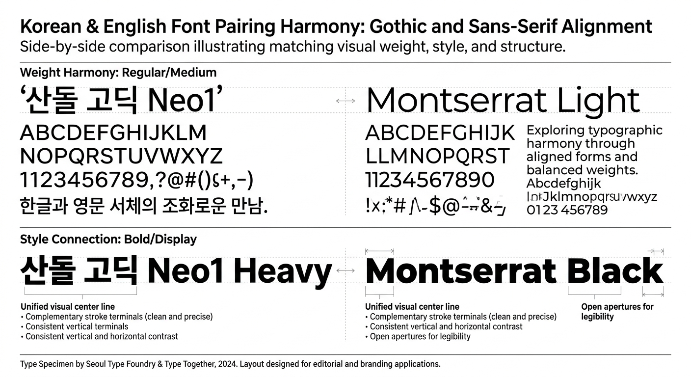
Harmony Through Shared Traits
The best font pairs share at least one structural characteristic:
- Similar x-height — Characters appear the same visual size
- Similar stroke weight — Neither font overpowers the other
- Compatible proportions — Letter widths feel related
- Matching geometric basis — Both round, both geometric, or both humanist
Think of it like fashion: you don't need to match everything, but there should be a thread of coherence.
Korean + English Pairing Strategies
Pairing across scripts adds a layer of complexity.
Here are strategies that work specifically for Korean-English combinations.
Strategy 1: Match the Category
The simplest approach — pair fonts from equivalent categories:
| Korean Category | English Category | Result |
|---|---|---|
| Gothic (고딕) | Sans-serif | Clean, modern |
| Batang (바탕) | Serif | Classic, literary |
| Handwriting (손글씨) | Handwriting/Script | Personal, warm |
| Decorative (장식) | Display | Bold, attention-grabbing |
This strategy is safe and reliable.
It won't win awards for creativity, but it won't fail either.
Strategy 2: Complementary Contrast
Pair fonts from different categories that create intentional contrast:
- Korean Gothic headline + English Serif body — Modern Korean meets classical English elegance
- Korean Batang headline + English Geometric Sans body — Traditional Korean authority with clean modern English
- Korean Handwriting accent + English Sans-serif body — Personal touch within professional framework
The key is making sure the contrast feels deliberate, not accidental.
Strategy 3: Same Superfamily
Some font families are designed to cover both Korean and Latin scripts with matching design principles.
Using these eliminates guesswork:
- Noto Sans KR + Noto Sans — Google's universal font family
- IBM Plex Sans KR + IBM Plex Sans — Corporate-grade bilingual family
- Pretendard — Includes well-designed Latin characters built into the Korean font
This is the safest strategy for projects where visual consistency is paramount, like enterprise software or government communications.
Strategy 4: Weight Matching
When pairing across scripts, match the visual weight rather than the numerical weight.
A Korean font at weight 400 (Regular) often appears visually heavier than a Latin font at the same weight, because Korean characters fill more of their bounding box.
Practical tip: If your Korean text is set at Regular (400), try your English text at Medium (500) to achieve visual parity.
Test at actual size to confirm.
Common Font Pairing Patterns
Here are battle-tested patterns organized by design mood.
The Classic Pair
Korean: Noto Serif KR (headline) / Noto Sans KR (body)
English: Playfair Display (headline) / Inter (body)
This combination works for editorial design, luxury branding, and content-heavy websites.
The serif headlines create authority while sans-serif body text ensures screen readability.
The Modern Minimalist
Korean: Pretendard (all weights)
English: Inter or Geist (all weights)
When in doubt, go minimal.
A single well-designed font family per script, using weight and size variations for hierarchy.
This pattern dominates in tech products and modern web design.
The Friendly Approachable
Korean: SUIT or Wanted Sans (headline) / Pretendard (body)
English: Poppins (headline) / Nunito (body)
Rounded letterforms and generous proportions create a warm, approachable feel.
Ideal for consumer apps, education platforms, and lifestyle brands.
The Bold Statement
Korean: Black Han Sans (headline)
English: Montserrat Black (headline) / DM Sans (body)
Maximum impact for hero sections and key marketing messages.
Use sparingly — bold display fonts lose their punch when overused.
The Editorial Sophisticate
Korean: KoPub Batang (headline + body)
English: Cormorant Garamond (headline) / Source Sans 3 (body)
Refined and literary.
Serif Korean paired with a high-contrast serif English creates a premium reading experience.
Best for blogs, magazines, and cultural content.
Common Mistakes to Avoid
Using Too Many Fonts
The classic beginner mistake.
Two fonts is usually enough. Three is the maximum for most projects.
Every additional font adds visual noise and increases page weight.
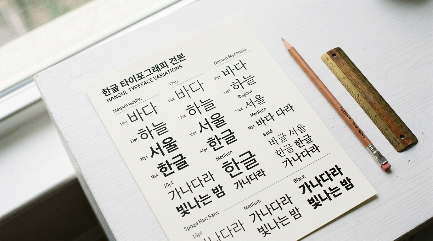
Ignoring Visual Size Differences
At the same font-size value, Korean and English text will appear different sizes.
Korean characters occupy a full square block and appear larger.
Either adjust sizes per script or choose fonts whose visual sizes happen to align.
Pairing Similar Fonts
If your two fonts look almost-but-not-quite the same, they'll just look like a mistake.
Ensure enough contrast that the pairing feels intentional.
Forgetting About Numbers
Your font pair needs to handle numbers well, especially in bilingual contexts where figures appear alongside both scripts.
Test dates, prices, statistics, and phone numbers.
Neglecting Dark Mode
A font pairing that works in light mode might fail in dark mode.
Thin fonts tend to appear thinner on dark backgrounds (halation effect).
Test both color schemes early.
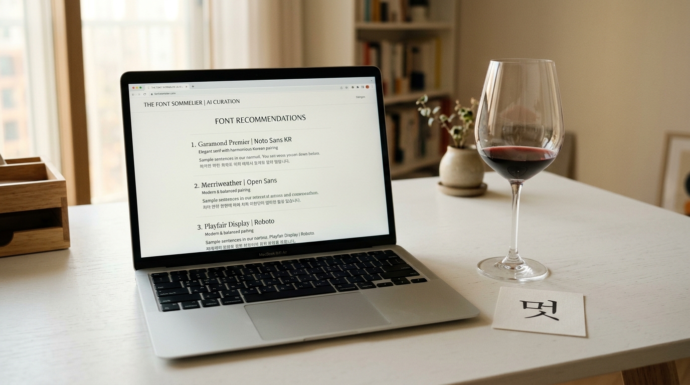
Using AI for Font Pairing
Manual font pairing requires experience and a trained eye.
AI tools can accelerate this process significantly.
How AI Font Recommendation Works
Modern AI font recommendation engines like Gulim analyze fonts across multiple dimensions:
- Visual characteristics — Stroke weight, contrast, proportions, x-height
- Mood vectors — Mapping fonts to emotional/aesthetic qualities (modern, warm, playful, formal)
- Category relationships — Understanding which font categories naturally complement each other
- Usage context — Optimizing recommendations based on whether you need a headline font, body font, or UI font
Practical Workflow with AI
Here's how to integrate AI into your font pairing workflow:
- Start with mood — Describe the feeling you want: "professional but friendly," "luxury minimalist," "playful tech startup"
- Get recommendations — Use Gulim's AI chat to receive font suggestions based on your mood description
- Review pairings — AI can suggest Korean-English pairings that share compatible mood vectors
- Get CSS code — Copy the provided CSS font-face code directly into your project
- Refine — Use the AI as a starting point, then fine-tune based on your specific layout and content
The Agent Skill Shortcut
If you use Claude Code, you can install the Gulim Agent Skill and use the /font command directly in your IDE.
Describe a mood keyword and get font recommendations + CSS code + a full design guide without leaving your editor.
Font Pairing Cheat Sheet
Here's a quick-reference table for common pairing needs:
For Tech/SaaS Products
- Korean: Pretendard (400, 600, 700)
- English: Inter (400, 500, 700)
- Why: Both are designed for screen readability with consistent proportions
For E-commerce
- Korean: SUIT (headline) + Pretendard (body)
- English: DM Sans (headline) + Inter (body)
- Why: Clean readability for product descriptions, friendly for marketing copy
For Editorial/Blog
- Korean: Noto Serif KR (headline) + Noto Sans KR (body)
- English: Merriweather (headline) + Source Sans 3 (body)
- Why: Serif headlines create editorial authority, sans-serif body aids online reading
For Luxury/Premium
- Korean: KoPub Batang (headline) + Pretendard (body)
- English: Cormorant (headline) + Jost (body)
- Why: High-contrast serifs signal premium quality
For Kids/Education
- Korean: A fun handwriting font (headline) + SUIT (body)
- English: Fredoka (headline) + Nunito (body)
- Why: Rounded, playful fonts feel approachable and friendly
Testing Your Font Pairing
Before committing to a font pairing, run through this checklist:
- Size range — Does it work from 12px captions to 72px headlines?
- Weight range — Can you create hierarchy using only weight changes?
- Dark mode — Do both fonts remain legible on dark backgrounds?
- Mobile — Do the fonts render well on small screens?
- Performance — What's the total font file size? (Target: under 200 KB for initial load)
- Real content — Test with actual Korean and English text, not placeholder text
- Mixed context — Check how Korean and English look when mixed in the same paragraph
- Numbers and punctuation — Verify alignment and visual consistency
Conclusion
Font pairing is part science, part art, and part intuition developed through practice.
For Korean-English projects, the additional complexity of cross-script pairing makes systematic approaches even more valuable.
Start with the proven patterns in this guide, use AI tools to expand your options, and always test with real content at real sizes.
The perfect font pairing isn't the most creative one — it's the one that serves your content and audience best.
Quick Action Steps:
- Identify your project's mood (use 2–3 adjectives)
- Choose a pairing pattern from this guide that matches
- Test with Gulim for AI-optimized suggestions
- Validate using the testing checklist above
- Ship it and iterate based on user feedback
Happy pairing!